Last Updated: January 30, 2026 | Author: Alex Masterson, Lead Printing Engineer
Understanding color in print design requires both creative intuition and technical precision. This comprehensive guide explains the psychology behind color choices, the technical specifications that ensure accurate reproduction, and the strategic decisions that maximize response rates.
Whether you’re designing promotional materials for the first time or optimizing an existing campaign, this resource provides actionable insights backed by research and industry experience.
YTable of Contents
- The Psychology of Color in Marketing Materials
- Understanding Color Spaces: CMYK vs. RGB
- Technical Specifications for Print-Ready Files
- Strategic Color Combinations for Maximum Impact
- Paper Stock and Finish: How They Affect Color
- Cost-Effective Printing Solutions
- Common Mistakes and How to Avoid Them
- Frequently Asked Questions
The Psychology of Color in Marketing Materials
Color influences decision-making at a subconscious level. According to research published in Management Decision by Satyendra Singh, color increases brand recognition by up to 80% among consumers. In print marketing, where you typically have less than three seconds to capture attention, color becomes your primary tool for creating emotional resonance before a single word is read.
How Different Colors Influence Behavior
Red: Urgency and Energy Red increases heart rate and creates a sense of urgency. Restaurants frequently use red in their marketing because it stimulates appetite. Retail businesses use red for clearance sales and limited-time offers because it triggers immediate action. However, red can also signal danger or warning, so context matters significantly.
Application Example: A fitness center promotion featuring red accents achieved 23% higher sign-up rates compared to blue variations in A/B testing conducted across 500 direct mail pieces.
Blue: Trust and Stability Blue builds credibility and communicates professionalism. Financial institutions, healthcare providers, and technology companies favor blue because it reduces anxiety and suggests reliability. Darker blues convey authority, while lighter blues feel approachable and calm.
Research Finding: A study by Joe Hallock found that 42% of adults identify blue as their favorite color, making it statistically the safest choice for broad demographic appeal.
Yellow: Attention and Optimism Yellow catches the eye faster than any other color due to its high visibility. It communicates happiness, energy, and caution. However, excessive yellow can cause eye strain, so it works best as an accent rather than a dominant color.
Design Principle: Use yellow for call-to-action buttons or highlight important information, but limit it to 10-15% of your total design area.
Green: Growth and Health Green represents nature, health, and financial prosperity. Organic food companies, environmental organizations, and financial services use green to align with these associations. Different shades communicate different messages—bright green feels energetic and youthful, while forest green appears sophisticated and established.
Black: Luxury and Authority Black communicates sophistication, power, and exclusivity. Luxury brands use black extensively because it creates psychological distance and perceived value. However, in printing, achieving true black requires technical knowledge (discussed in detail below).
Cultural Considerations
Color meanings vary significantly across cultures. While white represents purity in Western cultures, it symbolizes mourning in many Eastern cultures. Red signifies luck and prosperity in China but can indicate danger in Western contexts. If your target audience includes diverse cultural backgrounds, research color associations specific to those communities.
The Contrast Principle
Color psychology operates in relationships, not isolation. A red call-to-action button on a white background creates urgency. The same red button on an orange background becomes invisible. High contrast between text and background increases readability by 85% according to accessibility research from WebAIM.
Understanding Color Spaces: CMYK vs. RGB
The most common printing problem stems from confusion between color spaces. Understanding the fundamental difference between how screens and paper reproduce color is essential for achieving accurate results.
RGB: The Additive Color Model
RGB (Red, Green, Blue) creates color by emitting light. Your computer monitor, smartphone, and television contain pixels that emit red, green, and blue light in varying intensities. When all three colors combine at maximum brightness, you see white. When no light emits, you see black.
RGB color space characteristics:
- Creates approximately 16.7 million possible colors
- Produces vibrant, glowing effects impossible to achieve in print
- Device-dependent (colors vary between different screens)
- Designed for backlit displays
Common RGB values:
- Pure Red: R=255, G=0, B=0
- Pure Blue: R=0, G=0, B=255
- Bright Magenta: R=255, G=0, B=255
CMYK: The Subtractive Color Model
CMYK (Cyan, Magenta, Yellow, Key/Black) creates color through ink that absorbs certain wavelengths of light and reflects others. When cyan ink is applied to white paper, it absorbs red wavelengths and reflects cyan back to your eye. This is fundamentally different from emitting light.
CMYK color space characteristics:
- Creates approximately 70% of the colors visible in RGB
- Cannot reproduce neon or glowing effects
- More limited color gamut, especially in bright greens and blues
- Consistent across printing devices using standardized profiles
Why the “K” for Black? The “K” represents “Key” in printing terminology—the key plate that provides detail and contrast. Using “B” would create confusion with Blue. Additionally, achieving deep blacks requires more than just the K channel (explained below).
The Gamut Gap: Colors That Don’t Translate
Certain RGB colors cannot be reproduced in CMYK. Electric blue (R=0, G=255, B=255), neon green (R=0, G=255, B=0), and bright purple (R=128, G=0, B=255) will shift significantly when converted to print.
Real-world example: A designer creates a promotional piece with a vibrant electric blue background (R=0, G=100, B=255). When printed, the color appears as a dull purple-gray because the CMYK gamut cannot reproduce that specific wavelength combination. The conversion produces approximately C=100, M=75, Y=0, K=0—a completely different visual result.
Converting Between Color Spaces Correctly
In Adobe Photoshop:
- Open your design file
- Navigate to Edit > Convert to Profile
- Select “Coated FOGRA39” (Europe) or “U.S. Web Coated (SWOP) v2” (North America)
- Set Rendering Intent to “Relative Colorimetric”
- Enable “Black Point Compensation”
In Adobe Illustrator:
- Go to Edit > Edit Colors > Convert to CMYK
- Or set CMYK as your document color mode before beginning design
Important: Never simply change the color mode without converting. This assigns CMYK values to RGB colors without proper translation, resulting in even worse color shifts.
Rich Black vs. Standard Black
Standard black (C=0, M=0, Y=0, K=100) appears washed-out when printed as a large area. To achieve deep, saturated blacks for backgrounds and large elements, use Rich Black formulas:
Recommended Rich Black formulas:
- Cool Rich Black: C=60, M=40, Y=40, K=100
- Warm Rich Black: C=50, M=50, Y=50, K=100
- Maximum Density: C=75, M=68, Y=67, K=90
Critical Warning: Never use Rich Black for small text. The registration between four ink layers can create fuzzy edges on small letterforms. Always use K=100 only for text below 24pt.
Color Profiles and ICC Standards
Professional printing uses ICC (International Color Consortium) profiles to ensure consistency. Common profiles include:
- FOGRA39 (ISO Coated v2): European standard for coated paper
- GRACoL 2006: North American standard for offset printing
- SWOP (Specifications for Web Offset Publications): Magazine and publication standard
Always ask your printer which color profile they use and embed it in your document before exporting.
Technical Specifications for Print-Ready Files
Proper file setup prevents costly reprints and delays. Following these specifications ensures your design prints exactly as intended.
Resolution Requirements
300 DPI minimum for all printed materials. DPI (dots per inch) determines image sharpness. A 72 DPI image—standard for web—appears pixelated and blurry when printed.
Resolution by element type:
- Photographs and raster images: 300 DPI
- Line art and text: 600-1200 DPI preferred
- Large format (posters over 24″): 150-200 DPI acceptable due to increased viewing distance
Calculation example: For a 5″ × 7″ flyer with images, you need image files at least 1500 × 2100 pixels (5 inches × 300 DPI = 1500 pixels).
Bleed Area and Trim Marks
Bleed is the extra area beyond your final trim size where background colors and images extend. Standard bleed is 0.125 inches (3mm) on all sides.
Why bleed matters: Commercial cutting equipment has a tolerance of approximately 1/32 inch. Without bleed, minor misalignment during cutting creates white edges on your finished piece.
Safe area: Keep important text and design elements at least 0.25 inches from the trim edge to prevent accidental cutting.
File Formats and Compression
Preferred formats (in order):
- PDF/X-4 – Industry standard, embeds fonts and profiles
- PDF/X-1a – Older standard, still widely accepted
- Native files (AI, INDD) – Requires providing linked images and fonts
Avoid these formats:
- JPEG – Lossy compression degrades quality with each save
- PNG – Not designed for CMYK color space
- Word documents – No control over color management
PDF export settings:
- Color conversion: Convert to Destination (preserve CMYK)
- Compression: Do not downsample images
- Marks and Bleeds: Include crop marks and bleed
- Output: PDF/X-4:2010 standard
Typography Considerations
Font embedding: Always embed or outline fonts to prevent substitution issues.
Minimum font sizes:
- Body text: 9pt minimum (10-12pt recommended)
- Fine print: 7pt absolute minimum
- Large headlines: No maximum, but consider ink coverage costs
Overprint settings: Black text should overprint colored backgrounds (set to overprint in Illustrator) to prevent white halos from registration issues.
Strategic Color Combinations for Maximum Impact
Effective color pairing creates visual hierarchy and guides the viewer’s eye through your design. Understanding color relationships enables strategic decision-making rather than arbitrary choices.
Color Harmony Models
Complementary colors (opposite on the color wheel) create maximum contrast and energy:
- Blue and Orange
- Red and Green
- Purple and Yellow
Analogous colors (adjacent on the color wheel) create harmony and cohesion:
- Blue, Blue-Green, Green
- Red, Red-Orange, Orange
- Purple, Purple-Blue, Blue
Triadic colors (equally spaced on the color wheel) create balanced, vibrant schemes:
- Red, Yellow, Blue
- Orange, Green, Purple
Industry-Specific Color Strategies
Food Service: Primary: Red or Orange (appetite stimulation) Secondary: Yellow (happiness) or Brown (wholesomeness) Paper: Gloss finish to make food appear fresh
Healthcare: Primary: Blue (trust) or Green (healing) Secondary: White (cleanliness) Paper: Matte finish to reduce anxiety from harsh glare
Real Estate: Primary: Navy Blue (stability) or Forest Green (growth) Secondary: Gold or Tan (luxury, earthiness) Paper: Heavy stock (16pt+) to convey property value
Technology: Primary: Blue (innovation) or Gray (sophistication) Secondary: Bright accent color (cyan, lime green) Paper: Matte or soft-touch coating for modern feel
Retail/Sales: Primary: Red (urgency) Secondary: Yellow (attention) or Black (contrast) Paper: Glossy to maximize color vibrancy
Contrast Ratios for Readability
The Web Content Accessibility Guidelines (WCAG) provide contrast ratios that apply to print:
Minimum contrast ratios:
- Large text (18pt+): 3:1 minimum
- Body text: 4.5:1 minimum
- Optimal readability: 7:1 or higher
High-performing combinations:
- Black text on white background: 21:1 (maximum contrast)
- Black text on yellow background: 19.56:1
- Dark blue (C=100, M=100) on white: 8.59:1
- White text on red (M=100, Y=100): 5.25:1
Poor combinations to avoid:
- Yellow text on white background: 1.07:1 (illegible)
- Light blue on white: 2.34:1 (insufficient for body text)
- Red text on black background: 5.25:1 (acceptable but causes eye strain)
Creating Visual Hierarchy with Color
Use color to establish reading order and importance:
- Primary message: Highest contrast, boldest color (typically your call-to-action)
- Secondary information: Supporting colors with medium contrast
- Background/texture: Low contrast, subtle colors that don’t compete
Example structure:
- Headline: Black text (K=100) on white background
- Call-to-action: White text on red background (M=100, Y=100, K=0)
- Body text: Dark gray (K=70) on white background
- Background pattern: Light gray (K=10) on white background
Paper Stock and Finish: How They Affect Color Appearance
The same ink printed on different paper produces dramatically different results. Understanding paper characteristics helps you choose materials that enhance your color strategy.
Paper Weight and Thickness
Paper weight in North America is measured in pounds (lb) or points (pt):
Common weights:
- 14pt (100lb Cover): Standard flyer weight, stiff enough to distribute, cost-effective
- 16pt (110lb Cover): Premium feel, noticeably thicker, resists bending
- 14pt + coating: Comparable feel to 16pt uncoated due to coating thickness
Weight psychology: Heavier paper unconsciously communicates higher value. A 16pt matte piece feels 40% more premium than a 14pt glossy piece in blind tactile tests.
Coated vs. Uncoated Paper
Coated paper has a clay coating applied to the surface:
- Ink sits on top rather than absorbing
- Colors appear brighter and more saturated
- Provides protection from fingerprints and moisture
- Available in gloss, satin, and matte finishes
Uncoated paper has no surface treatment:
- Ink absorbs into fiber, creating “dot gain”
- Colors appear softer and darker
- Writeable surface (important for forms or certificates)
- More environmentally friendly perception
Finish Types and Their Effects
Gloss Finish:
- Reflects light, making colors appear 15-20% more saturated
- Creates high contrast between dark and light areas
- Best for: Food photography, product images, vibrant designs
- Drawback: Glare under direct light, shows fingerprints
Matte Finish:
- Absorbs light, creating soft, elegant appearance
- Reduces contrast slightly, creating sophisticated look
- Best for: Professional services, luxury products, text-heavy designs
- Drawback: Colors appear less vibrant than on gloss
Satin/Silk Finish:
- Compromise between gloss and matte
- Subtle sheen without harsh glare
- Best for: Versatile choice when audience preference is unknown
- Slightly more expensive than gloss or matte
Soft-Touch/Velvet Coating:
- Velvety, tactile surface
- Creates premium, luxury feel
- Best for: High-end products, fashion, beauty industries
- Most expensive finish option
Dot Gain and Color Shift
Dot gain occurs when ink spreads into paper fibers, making colors darker than intended. This effect is more pronounced on uncoated paper.
Typical dot gain percentages:
- Coated gloss: 10-15%
- Coated matte: 15-20%
- Uncoated: 20-30%
Compensation strategy: When printing on uncoated stock, reduce ink density by 10-15% to compensate for expected gain. For example, if your design uses C=80, M=60, Y=40, K=20, adjust to approximately C=70, M=50, Y=30, K=15 for uncoated printing.
Cost-Effective Printing Solutions
Understanding printing economics helps you make informed decisions that balance quality and budget.
Offset vs. Digital Printing
Offset Printing:
- Setup cost: $100-300 per job
- Per-unit cost decreases significantly with quantity
- Break-even point: Typically 500-1000 pieces
- Best for: Large runs (1000+ pieces)
- Color consistency: Excellent once press is calibrated
Digital Printing:
- Setup cost: Minimal ($0-50)
- Per-unit cost remains consistent regardless of quantity
- Break-even point: Below 500 pieces
- Best for: Short runs, variable data, quick turnaround
- Color consistency: Good, but may vary slightly between print sessions
Cost comparison example:
- 100 flyers: Digital = $75 | Offset = $275 (Digital wins)
- 1,000 flyers: Digital = $450 | Offset = $380 (Offset wins)
- 5,000 flyers: Digital = $2,100 | Offset = $850 (Offset wins significantly)
Ink Coverage and Cost
Ink coverage is measured as a percentage. Heavy ink coverage (above 250% total) increases costs and drying time.
Total Ink Coverage calculation: Add all four CMYK values. Example: C=80, M=60, Y=40, K=20 = 200% coverage (moderate)
Cost-saving strategies:
- Use lighter background tints instead of solid colors
- Reserve heavy coverage for small accent areas
- Choose colors with lower total ink percentages
- Use white space strategically to reduce ink costs
High-coverage color: C=100, M=100, Y=100, K=50 = 350% coverage (very expensive, excessive drying time)
Low-coverage alternative: C=80, M=70, Y=60, K=30 = 240% coverage (significant cost savings, faster production)
Quantity Sweet Spots
Print pricing operates on quantity breaks:
Typical break points:
- 250 pieces: Initial economy of scale
- 500 pieces: Offset becomes competitive
- 1,000 pieces: Significant per-unit cost reduction
- 2,500 pieces: Major break point for offset
- 5,000+ pieces: Maximum economy
Strategic ordering: If you need 900 flyers, ordering 1,000 often costs the same or less due to quantity breaks.
Common Mistakes and How to Avoid Them
Mistake 1: Designing in RGB Mode
The problem: You design your entire piece in RGB, then convert to CMYK at the last minute. Colors shift dramatically, especially bright blues, greens, and purples.
The solution: Set your document to CMYK color mode before beginning design. If you must start in RGB, perform test conversions early to see how colors will shift, then adjust your RGB values to achieve desired CMYK results.
Mistake 2: Using Low-Resolution Images
The problem: You grab an image from a website (72 DPI) and place it in your print design. It looks acceptable on screen but prints blurry and pixelated.
The solution: Always verify image resolution before placing. In Photoshop, check Image > Image Size. At your final print dimensions, resolution should be 300 DPI minimum. If an image is too low resolution, either find a higher quality version or use it at a smaller size.
Mistake 3: Insufficient Contrast
The problem: Your design looks great on your bright monitor, but body text disappears on the printed piece because there’s insufficient contrast between text and background.
The solution: Use a contrast checking tool during design. Aim for 4.5:1 minimum for body text. Print test pages on your desktop printer to evaluate readability before committing to a full run.
Mistake 4: Ignoring Bleed Requirements
The problem: Your background color or image stops exactly at the trim line. After cutting, white edges appear due to slight misalignment.
The solution: Always extend background elements 0.125″ beyond the trim line. Set up bleed guides in your design software and verify background elements extend into the bleed area before exporting.
Mistake 5: Rich Black on Small Text
The problem: You apply Rich Black (multiple ink layers) to small text. The result is fuzzy, blurry letters because the four ink colors don’t align perfectly on tiny letterforms.
The solution: Use K=100 only for text below 24pt. Reserve Rich Black for large areas and headlines above 48pt where slight misregistration won’t be noticeable.
Mistake 6: Not Requesting a Proof
The problem: You submit your file and approve it for printing without seeing a proof. The final printed piece has a color issue or technical problem.
The solution: Always request a digital PDF proof or, for critical projects, a physical proof. Review carefully for color accuracy, text readability, image quality, and layout before approving the full print run.
Frequently Asked Questions
Q: Why do my colors look different on my phone compared to my computer?
A: Different devices use different color profiles and screen technologies. Your phone might use a wider color gamut (P3) than your computer (sRGB), creating variations. Additionally, screen brightness, ambient lighting, and device age all affect color perception. For print design, always evaluate colors in CMYK mode using calibrated monitors when possible.
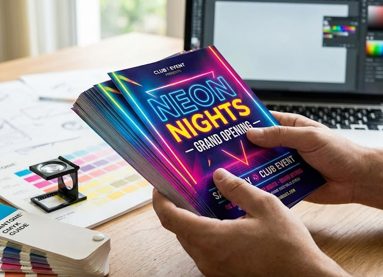
Q: Can I achieve neon colors in print?
A: Standard CMYK printing cannot reproduce true neon colors. However, you have options: (1) Use fluorescent or neon spot color inks (Pantone fluorescent series), (2) Choose bright, highly saturated CMYK colors that approximate neon appearance, or (3) Use special fluorescent paper stocks that enhance brightness.
Q: How do I match my brand colors exactly in print?
A: If your brand uses specific colors, obtain the Pantone (PMS) numbers from your brand guidelines. You can either: (1) Print using spot color inks that match exactly, or (2) Use the Pantone-to-CMYK conversion values provided in Pantone guides, understanding there may be slight variation due to gamut limitations.
Q: What’s the difference between matte and gloss for my project?
A: Choose gloss if: your design features vibrant colors, food photography, or product images where you want maximum color saturation. Choose matte if: your design is text-heavy, targets professional audiences, requires a writeable surface, or aims for a sophisticated, upscale feel. Matte also performs better under bright lighting conditions where gloss creates problematic glare.
Q: How does paper color affect my design?
A: Colored paper stocks interact with ink colors. Yellow ink on cream paper appears more orange. Blue ink on yellow paper appears green. When using colored stock, either: (1) Incorporate the paper color into your design as a background element, or (2) Use opaque white ink as a base layer before applying colors (more expensive but provides color accuracy).
Q: Should I use vector or raster graphics?
A: Use vector graphics (created in Adobe Illustrator, formatted as AI, EPS, or PDF) for: logos, text, icons, and simple illustrations. Vectors scale infinitely without quality loss. Use raster graphics (Photoshop, formatted as TIFF or PSD) for: photographs and complex imagery with gradients and textures. Maintain 300 DPI resolution for all raster elements.
Q: How do I reduce file size without losing quality?
A: For print files, prioritize quality over file size. However, you can: (1) Convert RGB images to CMYK (removes unnecessary color channel), (2) Remove unused layers and alpha channels, (3) Flatten images where transparency isn’t needed, (4) Use PDF compression settings designed for print (avoid “smallest file size” presets), and (5) Crop images to remove unnecessary areas before placing in layout.
Conclusion: Bringing It All Together
Successful print design balances creative vision with technical precision. Understanding color psychology helps you make strategic choices that resonate with your target audience. Mastering color spaces ensures those choices translate accurately from screen to paper. Following technical specifications prevents costly mistakes and reprints.
The investment in proper setup—designing in CMYK, using appropriate resolution, adding bleed areas, and choosing the right paper stock—pays dividends in final results that match your creative vision and achieve your marketing objectives.
Whether you’re creating your first promotional flyer or optimizing an established campaign, these principles provide a foundation for professional-quality print materials that command attention and drive results.
About the Author: Alex Masterson is a Lead Printing Engineer with over 15 years of experience in commercial print production. He has overseen more than 5 million impressions across offset and digital platforms and specializes in color management and print quality optimization.