

You are at the checkout screen. You have your hang tag design ready—your logo looks great, the font is perfect, and you’ve double-checked the spelling. Then, you hit the dropdown menu for “Paper Stock,” and you pause.
14pt Gloss Cover? 18pt Premium Kraft?
It feels like a small technical detail, like choosing between a matte or glossy photo print. But in the world of retail, this decision is massive. It is the difference between a customer perceiving your brand as “modern, sleek, and established” or “authentic, handmade, and eco-conscious.”
Paper stock is not just a carrier for your ink; it is the background music of your brand. It sets the mood before the customer even reads a single word.
If you are torn between the rustic charm of Kraft and the vibrant punch of Gloss, you are not alone. This is one of the most common questions we get at CheapFastPrinting.com. In this guide, we are going to strip away the jargon and look at the psychology, durability, and print capabilities of both stocks so you can stop guessing and start branding.
The Psychology of Touch: Why Paper Matters
We live in a digital world, which makes physical touch rarer and more valuable. When a customer picks up your product in a shop (or pulls it out of a shipping box), their fingertips are gathering data.
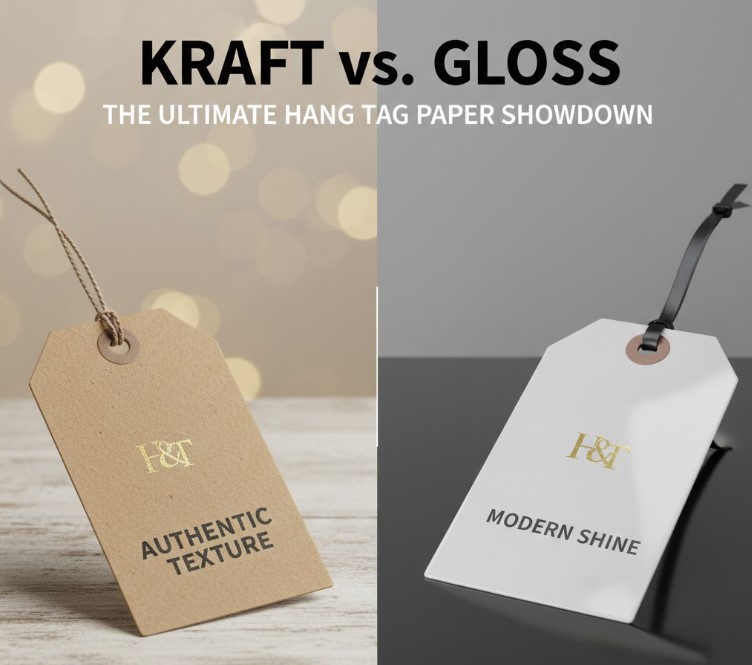
Gloss feels smooth, cool, and coated. It feels “finished.” It triggers a psychological association with magazines, high-end electronics packaging, and mainstream retail. It says, “We have high production values.”
Kraft feels textured, warm, and fibrous. You can feel the pulp. It triggers associations with nature, history, and craftsmanship. It says, “A human being made this.”
Neither is “better” in a vacuum. The problem arises when there is a mismatch between your product and your paper. A sleek, high-tech phone accessory looks confusing on rustic brown kraft paper. Conversely, a hand-poured beeswax candle looks cheap and generic on high-gloss stock.
The Contender: 14pt Gloss Cover
Let’s start with the industry standard. When we say “Gloss,” we are usually talking about our 14pt Gloss Cover. This is a sturdy cardstock coated with a UV (Ultraviolet) layer that cures instantly under light to create a high-shine finish.
When Gloss Wins
1. You Use Photos or Complex Graphics This is the biggest differentiator. If your hang tag design includes a photograph of a model wearing your clothes, a full-color image of your ingredients, or a complex gradient background, Gloss is the undisputed winner. The coating keeps the ink sitting on top of the paper rather than soaking into it. This means blacks are deeper, colors are punchier, and images look sharp and high-definition.
2. Durability and Protection That UV coating is basically armor for your tag. Gloss hang tags are more resistant to moisture, fingerprints, and friction. If your product is going to be handled by hundreds of people in a retail store, or if it’s an outdoor product that might get splashed, gloss wipes clean. Uncoated papers absorb oils from fingers; gloss repels them.
3. The “Retail Ready” Vibe If you are trying to get your product into big-box stores or want to compete with major commercial brands, gloss is the safe, expected choice. It signals consistency and professionalism.
The Downside of Gloss
1. The Glare Under harsh fluorescent store lighting, highly reflective tags can sometimes be hard to read at certain angles.
2. You Can’t Write on It This is the classic mistake. A brand orders High Gloss UV on both sides, then realizes they need to hand-write the price or a batch code on the back. Ink creates a smudge; pencil doesn’t work at all. Pro Tip: If you want the shine but need functionality, order Gloss Front / Uncoated Back. This gives you the best of both worlds—sexy on the front, functional on the back.
The Challenger: 18pt Premium Kraft
Now, let’s talk about the textured favorite. Our 18pt Premium Kraft is distinct because it is thicker than the standard gloss (18pt vs 14pt), and it is made from recycled fibers. It has that distinct light-brown, cardboard color.
When Kraft Wins
1. The “Eco-Friendly” Signal Sustainability is no longer a niche; it’s a requirement for many consumers. While many paper stocks (including our standard ones) are recyclable, Kraft looks the part. It immediately communicates that your brand cares about the environment. If you sell organic cotton, vegan snacks, or upcycled goods, Kraft reinforces your USP (Unique Selling Proposition) instantly.
2. High Contrast with Black Ink There is something timeless about black ink on brown paper. It is high-contrast and easy to read, but softer on the eyes than black on white. It feels vintage and industrial.
3. Hiding Imperfections Because Kraft has a natural, fibrous texture with little flecks of darker pulp, it is very forgiving. If your hang tag gets a little bent or scuffed, it looks like “patina” or character. On a glossy tag, a scratch looks like damage.
The Downside of Kraft (and How to Design Around It)
This is where you need to pay attention, because designing for Kraft requires a different mindset than designing for white paper.
1. White Ink Does Not Exist (Usually) In standard offset printing (CMYK), there is no “white” ink. White is simply the absence of ink, revealing the paper underneath. On a glossy tag, 0% ink equals white. On a Kraft tag, 0% ink equals brown. If your logo has white elements, they will disappear into the paper color. If you have a photo with a bright sky, that sky will look muddy and brown. You need to design with bold, dark colors (Black, Navy, Dark Green, Maroon) and avoid light pastels or white space.
2. Colors Will Shift Think of printing on Kraft like painting on a brown wall instead of a white canvas. Every color you print will be influenced by the brown base. Yellows become ochre; blues become teal; reds become brick. This isn’t a defect; it’s physics. If you need 100% accurate Pantone color matching for your corporate branding, Kraft is going to fight you. If you embrace the muted, retro palette, it looks incredible.
The Middle Ground: Matte and Uncoated
What if you hate the shine of gloss but Kraft is too rustic for you?
This is where 16pt Premium Matte or 14pt Uncoated comes in.
- Matte has a coating, but it’s dull and silky. It feels incredibly premium (think Apple packaging) and sophisticated.
- Uncoated is simply raw white paper. It has a texture similar to printer paper but much thicker.
These are excellent choices for modern, minimalist brands that want the clean look of white paper without the “cheap” feeling of high gloss.
The Decision Matrix: 7 Questions to Ask Yourself
Still stuck? Don’t guess. Answer these seven questions, and the right paper choice will usually reveal itself.
- Do you need to write on the tag?
- Yes: Go Uncoated or Gloss Front/Uncoated Back.
- No: Gloss or Matte is fine.
- Does your design use photographs?
- Yes: You need Gloss or Matte (White stock). Kraft will ruin the photo.
- No (Logos/Text only): Kraft is an option.
- Is your brand “Natural/Organic” or “Tech/Modern”?
- Natural: Kraft.
- Modern: Matte or Gloss.
- What is your price point?
- Budget: 14pt Gloss is usually the most cost-effective.
- Luxury: 16pt Matte or thicker stocks feel more expensive.
- Artisan: 18pt Kraft implies small-batch quality.
- Is the tag design minimalist?
- Yes: Kraft loves minimalism. Black text on brown paper is a complete look.
- No: If you have a busy design, Gloss helps separate the elements.
- Will the product be sold outdoors or in humid environments?
- Yes: UV Gloss provides the best moisture barrier.
- Do you use white in your logo?
- Yes: Stick to white paper stocks (Gloss/Matte) unless you are okay with the white parts becoming brown.
Cost Reality Check
Here is the good news: At CheapFastPrinting.com, the price difference between these stocks is often negligible, especially at higher quantities.
Many business owners assume Kraft is expensive because it’s “specialty,” or that Gloss is expensive because it’s “coated.” The reality is that we print so much of both that we have optimized the costs. You shouldn’t make this decision based on saving pennies; you should make it based on what sells your product best.
The only time cost jumps significantly is if you start adding “extras” like Foil Stamping or Spot UV (raised gloss). But for standard printing? Pick the paper that fits the brand, not the budget.
Real World Examples
The Candle Maker
- Old Tag: 14pt Gloss with a photo of lavender. It looked generic, like something from a dollar store.
- New Tag: 18pt Kraft with just the logo and scent name in heavy black type.
- Result: The candles immediately looked handmade and premium. Customers stopped asking “is this mass produced?”
The Streetwear Brand
- Old Tag: Uncoated white paper. It got dirty easily and felt flimsy on a $60 hoodie.
- New Tag: 16pt Premium Matte with Spot UV on the logo.
- Result: The tag felt like a collectible. The matte finish matched the high-end fabric, and the Spot UV added a “hype” factor.
The Final Verdict
Your hang tag is a handshake. It’s an introduction.
If your handshake is slippery and plastic when it should be firm and warm, the introduction fails. If your handshake is rough and dirty when it should be polished and professional, the introduction fails.
Don’t overthink the technical specs—think about the feeling.
- Choose Gloss for vibrancy, protection, and retail-ready polish.
- Choose Kraft for authenticity, texture, and eco-signaling.
- Choose Matte for understated luxury and readability.
And remember, you don’t have to imagine it. We believe in “try before you buy.”
Ready to feel the difference? We can send you a sample pack so you can actually touch the 18pt Kraft and the 16pt Matte before you order. Or, if you’re ready to go, upload your art and let our team check if your design is “Kraft-friendly” for free.