

Let’s get real about custom hang tags printing for a second. Most business owners treat them like an afterthought, slapping a logo and price on whatever template they find online, then wondering why their handmade candles sit on the shelf while the competitor’s identical product flies off at twice the price. The difference? That little piece of cardstock hanging from the string.
Your hang tag is working harder than you think. Before customers smell the candle, before they check the fabric blend, before they even read your brand story on the back label, their fingers are already forming an opinion based on the thickness of that paper, the smoothness of the finish, the weight of it in their hand. It’s the first thing they touch when picking up your product.
This guide will walk you through every decision that separates amateur hang tags from the ones that make customers think “this brand gets it” and reach for their wallet.
The First Two Seconds: Why Most Hang Tags Fail
Here’s what happens in a retail environment. A potential customer is walking past your display. They’re not looking for you specifically, they’re browsing. Their eyes land on your product for maybe half a second. If nothing grabs them, they keep walking. But if something catches their attention, they reach out and pick it up.
That’s when your hang tag has exactly two seconds to do its job.
What Happens During Those Critical Moments
In those two seconds, their brain is processing texture, color, layout, and whether the information they’re seeing makes them want to know more or put the item back down. Most hang tags fail this test because they try to say everything at once, or worse, they say nothing at all.
The solution? Understand that your hang tag has layers, just like a conversation. The front is your hook. On the back, you deliver details. If you’re using a folded tag, the inside panels are where the story lives.

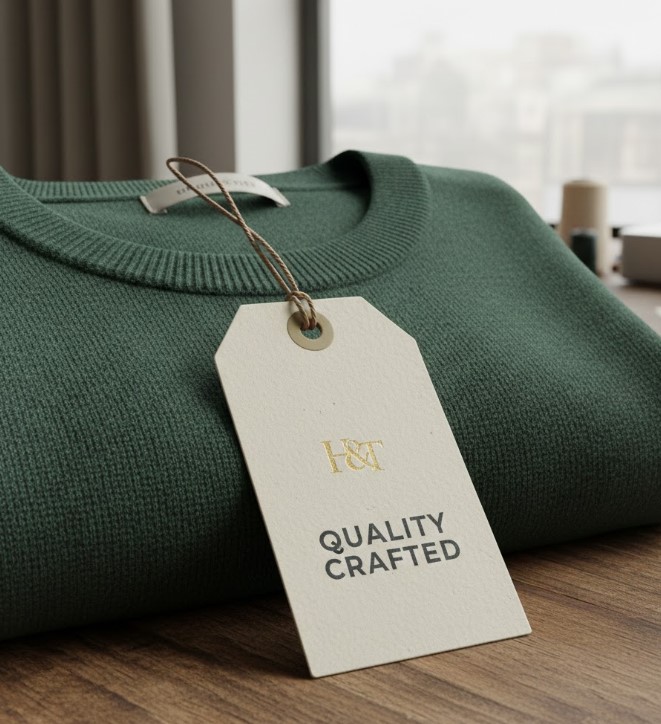
Paper Stock: The Silent Message You’re Already Sending
Walk into any boutique and grab two products off the shelf. One has a thin, flimsy tag that bends when you hold it. The other has a thick, substantial tag that feels like it could survive a washing machine. Which product feels more expensive? Which brand seems more established?
You already know the answer.
Why Thickness Communicates Value
Paper thickness communicates value before a single word gets read. This is not about being fancy for the sake of it. Making sure your physical product matches the price point you’re asking for is essential marketing.
Let’s break down the main paper stocks and what they’re actually saying to your customer:
14pt Gloss Cover: The Industry Standard
This is your industry standard. Customers are already used to seeing this thickness on most clothing and retail products. The UV coating gives it that high-gloss shine that makes colors pop, protects the tag from moisture and scratches, and creates a professional finish. If you’re selling anything photo-heavy or color-intensive, this paper makes those images look vibrant and crisp.
The downside? Writing on it isn’t easy. If you need customers or staff to add notes, you’ll want UV on the front only, leaving the back writable.
16pt Premium Matte: Sophisticated Luxury
Here’s where you go when sophisticated is more important than shiny. Premium matte is thicker, which immediately signals quality, but the matte finish is what sets it apart. No glare, no reflections, just a smooth, silky texture that feels expensive the moment someone touches it.
Luxury boutiques, jewelry designers, high-end cosmetics—they all lean toward matte because it whispers instead of shouts. It says “we’re confident enough that we don’t need to be loud.”
18pt Premium Kraft: Eco-Conscious Authenticity
Kraft is for brands that want to communicate sustainability, handmade authenticity, or outdoor adventure. Made from 100% recycled fibers, you can see the natural flecks in the material. It’s thicker than standard stock, it has that raw, earthy texture, and it immediately makes people think “eco-conscious” or “artisan.”
If you’re selling organic soaps, hiking gear, farm-to-table products, or anything where natural ingredients matter, kraft paper is doing half your marketing before they even read your tag. One thing to remember: we don’t print with white ink on kraft, so any white areas in your design will show the natural brown paper color.
Matching Paper to Price Point
The wrong paper choice can sabotage everything else you do right. When charging premium prices, your hang tag needs to feel premium. If you’re positioning as eco-friendly, kraft paper reinforces that message instantly. For modern and clean branding, matte does the job.
Size Matters More Than You Think
You’ve probably noticed we offer about 20 different hang tag sizes. That’s not because we like confusing people. One size definitely does not fit all, and choosing the wrong dimensions can make your product look awkward.
Here’s how to think about size selection:
Small Format: 2″ x 2″ Square
This is your minimalist option. Perfect for small items where a larger tag would overpower the product. Jewelry tags, size markers attached to a main tag, small gift items, candles under 4 ounces all work beautifully with this size. If the product itself is tiny, keep the tag proportional. A massive hang tag on a delicate bracelet looks ridiculous.
Standard Format: 2″ x 3.5″
The business card size is popular for good reason. Customers are already familiar with this dimension. It feels standard without being boring. Big enough for your logo, price, a bit of story, and a QR code if you want one, this is the safe choice that works for most clothing, accessories, and mid-sized retail products.
Extended Vertical: 2″ x 4″ to 2″ x 5″
These dimensions give you that slim, extended vertical space. Perfect when you need room for a longer message without making the tag feel bulky. Great for t-shirts, hoodies, or when you want to add a QR code without crowding your logo. The extra height creates visual interest without taking up more width.
Bookmark Style: 2″ x 6″ to 2″ x 8″
Here’s where you’re moving into bookmark territory, and that’s actually a feature, not a bug. These long, elegant strips work beautifully on products where the tag becomes part of the aesthetic. We see these on denim jeans (attached to the back belt loop), wine bottles (hanging from the neck), gourmet food items, and yes, actual bookmarks included as free gifts with book purchases. The length gives you serious real estate for storytelling.
Modern Squares: 2.5″ x 2.5″ and 3″ x 3″
These are the contemporary squares becoming more popular because they photograph well (hello, Instagram), they feel modern, and they work great for products that need more surface area. Artisan candles, soap boxes, bakery packaging all benefit from this format. When you’re selling something people want to display, a square tag adds to the presentation.
Folded Tags: Mini-Brochures
Folded hang tags are your secret weapon when a single panel isn’t enough. A 2×4 tag that folds to 2×2 becomes a mini-brochure. Front panel: logo and hook. Inside panels: care instructions, brand story, warranty info, return policy.
We’ve seen these used brilliantly for high-maintenance garments (cashmere, silk, leather) where customers need washing instructions, and for products with a story to tell that won’t fit on one side.
The Proportionality Rule
Your hang tag should be proportional to your product and appropriate for the amount of information you need to communicate. Too small and it gets lost. Too big and it looks like you’re trying too hard.
Hole Placement: The Detail Nobody Thinks About Until It’s Wrong
You’d be surprised how many people design a beautiful hang tag, get it printed, and then realize the hole punched straight through their logo. That’s why we mark hole positions clearly on our templates, so you can design around them.
Understanding the Three Position Options
We offer three main positions: Top Left, Top Center, and Top Right. Each one affects how your tag hangs and what gets noticed first.
Top Center is the most common and the most balanced. The tag hangs straight, the weight is distributed evenly, and whatever’s at the top of your design gets seen first. Most applications work perfectly with this position.
Top Left or Top Right creates an asymmetrical hang, which can actually be an intentional design choice. When your logo is positioned to one side, punching the hole on that side balances the visual weight. Some brands use offset holes to create a more dynamic, less traditional look.
Designing Around the Punch
The key is designing with the hole in mind from the start. Download our templates. Look at where that red circle shows up. Make sure your most important visual elements aren’t getting punctured.
Color, Typography, and the Information Hierarchy
Let’s talk about what actually goes on your hang tag and how it should be organized.
Your hang tag is not a résumé. Fitting every single thing about your company on there isn’t the goal. What you need is a clear hierarchy: Hook → Details → Action.
The Hook: First Impression
The hook is what makes them want to read more. This could be your logo if your brand is already known. It could be a beautiful product photo. A headline like “Hand-Poured in Small Batches” or “100% Organic Cotton” works too. Whatever it is, it needs to be the dominant visual element on the front of your tag.
The Details: Secondary Information
Details live on the back or inside (if folded). Price, materials, care instructions, website, social handles all belong here. This is the information they’re looking for once they’ve decided they’re interested.
The Action: What Happens Next
Your call to action gives them something to do next. “Scan for Styling Tips.” “Follow @YourBrand for Restock Alerts.” “Bring This Tag Back for 10% Off Your Next Purchase.” Clear direction drives engagement.
Typography Mistakes to Avoid
Typography errors we see constantly: using six different fonts, making everything the same size so nothing stands out, picking decorative script fonts that look pretty but are impossible to read at small sizes. Keep it simple. One or two fonts maximum. Make your headlines bigger than your body text. Use contrast to guide the eye.
Color Mode and Printing Considerations
Remember that we print in CMYK, and what you see on your screen (RGB) will shift slightly in print. That’s why we offer free email proofs—you’ll see exactly how your colors will look before we print a single tag.
For rich, deep blacks, use a “rich black” mix (C=60, M=40, Y=40, K=100) instead of just K=100. For thin lines and small text, stick to K=100 to keep it crisp.
Finishes and Coatings: When to Add Them and Why
You’ve picked your paper. You’ve got your design locked in. Now the question is: what finish do you want?
No Coating: Raw and Natural
This is the default for uncoated stocks like kraft or matte paper. The raw paper texture is the finish. Perfect when you want that natural, tactile feel or when you need the tag to be writable.
High Gloss UV Coating (Front Only)
The most popular choice gives the front that glossy, protective layer that makes colors pop and protects against scratches and moisture. The back stays uncoated so you can write on it if needed. Ideal for price tags where staff might need to add notes or discount stickers.
High Gloss UV Coating (Both Sides)
Maximum protection and shine on every surface works when tags will be handled a lot, exposed to weather, or need to stay pristine through shipping and display. Just know that writing on these is nearly impossible without a paint pen.
Matte Finish: Sophisticated and Glare-Free
Some of our matte stocks come with a built-in matte coating that gives them that smooth, velvety feel. Choose this when you want elegance over flashiness.
Raised Print UV (Spot UV)
Here’s where things get fancy. Instead of coating the entire surface, we add a thick, clear UV layer to specific areas like your logo or certain design elements. This creates a 3D effect that you can actually feel. When light hits it, those raised sections pop visually. It’s a premium detail that makes your tag feel custom and high-end.
Raised Print Foil: Luxury Metallics
Metallic foil stamping on specific elements creates a luxury effect that’s impossible to ignore. Available in gold, silver, and rose gold, we see this on wedding favor tags, jewelry packaging, and premium cosmetics. It’s not cheap, but the perceived value increase often justifies the cost.
Design File Setup: How to Make Sure Your Tags Print Perfectly
Most printing mistakes happen before the file ever reaches our machines. Low-resolution images, wrong color mode, no bleed, fonts that aren’t embedded—let’s make sure your files are bulletproof.
Resolution Requirements
300 DPI minimum, 350 DPI recommended. This is non-negotiable. Images pulled from Google or social media are usually 72 DPI, and they will look blurry and pixelated when printed. When using photos, make sure they’re high-resolution from the start. Vector files (AI, EPS, PDF) scale infinitely without losing quality when working with logos.
Color Mode Setup
CMYK for offset printing, RGB for digital. Most of our hang tags are printed offset, which uses CMYK inks. Designs in RGB will be converted by us, but colors might shift. Design in CMYK from the start, or send us your files and we’ll handle the conversion and send you a proof to approve.
Bleed and Safe Zones
0.125 inches on all sides for bleed. If you want your background color or image to go all the way to the edge of the tag (no white border), you need to extend your design 0.125″ past the trim line. Our templates show exactly where the bleed area is, where the safe zone is (keep important text and logos here), and where the trim will happen. Design outside the lines so we can cut inside them.
Font Management
Convert to outlines or embed them. Files sent with fonts we don’t have installed will get substituted with something random and your design will look wrong. Always convert text to outlines (curves/paths) before sending final files, or make sure fonts are embedded in your PDF.
File Format Preferences
PDF is king. We accept JPG, PNG, TIFF, PSD, AI, but PDF is the most reliable. It preserves your layout, colors, and fonts exactly as you designed them. Export as PDF with bleed marks and crop marks if you can.
Free Design Assistance
Don’t have design skills? We offer completely free design setup for every hang tag order. Send us your logo, your text, any images you want included, and our team will build a professional design for you. We’ll send you a digital proof to approve before printing. For something more complex or custom, we also offer paid design services, but most customers are surprised by how good the free option is.
Common Mistakes That Make Tags Look Amateur
Let’s go through the errors we see most often, so you can avoid them:
Mistake #1: Tiny, Unreadable Text
Your customer is not going to squint at 6-point font to read your website URL. Make sure any text you actually want them to read is at least 10-12 point, preferably larger. When it’s hard to read on your computer screen, it’s impossible to read on a 2×3 tag.
Mistake #2: Overcrowding
Trying to fit your entire brand manifesto, three photos, your logo, social media icons, a QR code, care instructions, and your life story on one side of a hang tag creates chaos. White space is not wasted space. It’s breathing room. It’s sophistication. Less is more.
Mistake #3: Low-Contrast Color Combinations
Light gray text on white background. Pale yellow on cream. These might look subtle and pretty on your screen, but they disappear in real-world lighting. High contrast makes information readable. Dark text on light background, or vice versa.
Mistake #4: Ignoring the Back Side
Even if you order single-sided printing (front only, back blank), think about what that blank back communicates. Sometimes a clean, blank back is intentional and minimal. Other times it’s a missed opportunity. Use both sides when you have information worth sharing.
Mistake #5: Inconsistent Branding
Your hang tag should look like it belongs to the same family as your website, your packaging, your business cards. Same fonts, same color palette, same vibe. When your website is modern and minimal, your hang tags shouldn’t be ornate and vintage. Brand consistency builds recognition and trust.
Testing, Iterating, and Getting It Right
Here’s something most people don’t do: order a small test batch before committing to thousands of tags. We offer quantities starting at 100. Get a small run printed, attach them to your actual products, and see how they look in real life. Show them to friends. Bring them to a store and see how they compare to competitors on the shelf.
Learning From Real-World Testing
You might discover the color is slightly different than you expected. The size might feel too big or too small on the actual product. Hole position might not work the way you thought. Better to learn this with 100 tags than 5,000.
Tracking Performance
Pay attention to how they perform. Are customers asking questions that could have been answered on the tag? Do they rip the tags off immediately, or keep them attached? Are they posting photos on social media where your tag is visible (good sign) or cropping it out (bad sign)?
The best hang tag is one that gets better over time based on real feedback.
The Real Purpose of a Hang Tag
Let’s come back to the beginning. Your hang tag is not just a price marker. It’s not just a place to put your logo. In an increasingly digital world, it’s a physical touchpoint. When a stranger picks up something you made and decides whether you’re worth their money and their trust, that moment matters.
That little piece of paper is doing silent sales work for you 24/7. Answering questions when no salesperson is around, it communicates your values when you’re not there to explain them. It’s the difference between “just another product” and “this is special.”
Make Every Detail Count
Take it seriously. Invest the time to get the design right, choose the paper that matches your brand positioning, and make sure every detail from hole placement to finish communicates the quality you’re actually delivering.
At CheapFastPrinting.com, we’ve printed millions of hang tags for everyone from solo Etsy sellers to established fashion brands. We offer completely free design setup, free file review, and free email proofs because we want you to get it right the first time. Whether you need 100 tags or 100,000, we’re printing them on the same commercial-grade equipment, with the same high-quality papers, at prices that make sense for any budget.
Your product deserves a hang tag that works as hard as you do. Let’s make sure it gets one.
Main product: https://cheapfastprinting.com/products/hang-tags/