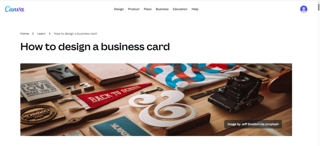
In today’s digital world, you might wonder if business cards still matter. The answer is a resounding yes. A well-designed business card remains one of the most powerful networking tools at your disposal. But with everyone handing out cards at networking events, how do you design business cards that stand out and actually get remembered?
This comprehensive guide will walk you through the essential elements of creating business cards that make a lasting impression and help you build meaningful professional connections.
Why Your Business Card Design Matters
Your business card is often the first tangible impression someone has of your brand. In those critical seconds after a handshake, your card speaks volumes about your professionalism, attention to detail, and brand identity. A generic, poorly designed card gets tossed in a drawer and forgotten. A standout card becomes a conversation starter and stays top of mind.
Start With Clear Brand Identity
Before diving into design elements, ensure your business card reflects your brand identity consistently. Your card should align with your website, logo, and other marketing materials. This consistency builds trust and makes your brand more memorable.
Consider your industry and target audience. A creative agency can experiment with bold, unconventional designs, while a law firm might opt for elegant simplicity. Your business card should signal to recipients that you understand your industry and their expectations.
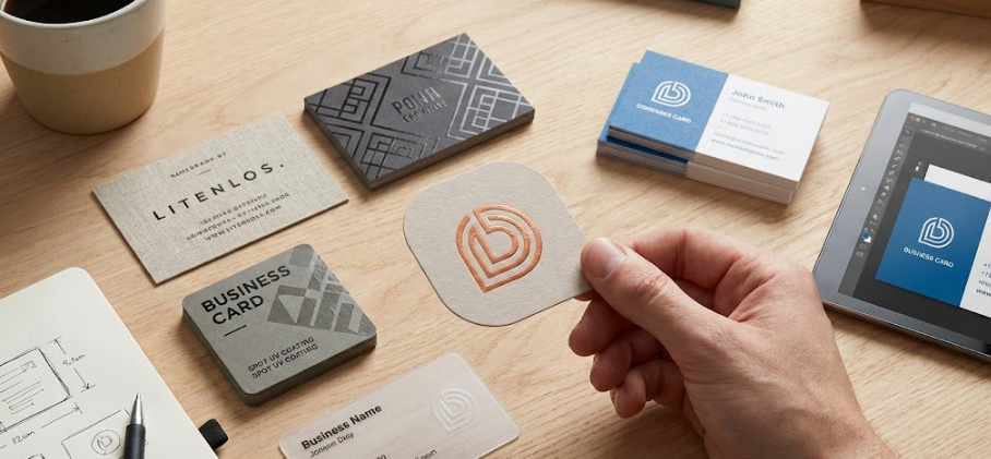
Choose the Right Card Stock and Finish
The physical quality of your business card matters just as much as the visual design. When someone holds your card, they’re forming an opinion about your business based on how it feels.
Premium card stock options include:
- Standard 14pt cardstock – Professional and cost-effective for most businesses
- 16pt or 18pt cardstock – Thicker, more substantial feel that conveys quality
- Textured stocks – Linen, felt, or cotton finishes add tactile interest
- Specialty materials – Plastic, metal, or wood for truly unique cards
Finish options to consider:
- Matte finish – Sophisticated and easy to write on
- Glossy finish – Vibrant colors and modern appearance
- Spot UV coating – Adds texture and highlights specific design elements
- Soft-touch coating – Luxurious, velvety feel that people love to touch
Master the Typography
Typography can make or break your business card design. Your name and essential information should be immediately readable, even at a quick glance.
Follow these typography best practices:
Keep font sizes readable – your name should be at least 10-12 points, with contact information no smaller than 8 points. Avoid tiny text that forces people to squint.
Limit yourself to two font families maximum. Using too many fonts creates visual chaos. Choose one font for headings (your name or company) and another for body text (contact details).
Ensure sufficient contrast between text and background. Black text on white is classic for good reason – it’s instantly readable. If using colored backgrounds, test readability carefully.
Strategic Use of White Space
One of the biggest mistakes in business card design is trying to cram too much information into a small space. White space (negative space) is not wasted space – it’s a powerful design element that creates breathing room and draws attention to what matters most.
A cluttered card overwhelms recipients and makes it difficult to find key information. Instead, embrace minimalism. Include only essential contact details: name, title, company, phone, email, and website. Remove anything that doesn’t serve a clear purpose.
Color Psychology and Your Brand
Colors evoke emotional responses and communicate messages before a word is read. Choose your business card colors strategically based on your industry and the impression you want to create.
Consider these color associations:
- Blue – Trust, professionalism, stability (ideal for finance, healthcare, technology)
- Red – Energy, passion, urgency (great for food, entertainment, sales)
- Green – Growth, health, nature (perfect for environmental, wellness, financial brands)
- Black – Luxury, sophistication, power (excellent for high-end services)
- Purple – Creativity, wisdom, luxury (works well for creative industries)
Don’t feel obligated to use every color in your logo on your business card. Sometimes a simplified color palette creates more impact.
Make Your Contact Information Easy to Find
The primary purpose of a business card is sharing contact information. Make sure recipients can quickly find what they need to reach you.
Organize information hierarchically, with your name and company most prominent, followed by your title, then contact details. Use subtle visual cues like spacing or divider lines to group related information.
Include only contact methods you actually use and check regularly. There’s no point listing a phone number you never answer or an email address you rarely check.
Add a Unique Design Element
To truly stand out, incorporate one distinctive design element that makes your card memorable. This could be:
- An unusual shape – Rounded corners, die-cut edges, or custom shapes (while keeping the card wallet-friendly)
- A compelling image or illustration – Professional headshot, abstract design, or brand-specific artwork
- A textured pattern – Subtle background patterns that add visual interest without overwhelming
- Spot color or metallic foil – Strategic use of gold, silver, or spot colors for logos or accents
- A clever use of the back side – Don’t waste this valuable real estate
Include a Call to Action
Your business card can do more than share contact information. Consider adding a subtle call to action that encourages recipients to engage with your business.
This might be: “Visit our website for a free consultation,” “Scan for our portfolio,” or “Check out our latest work at [website].” A QR code linking to your portfolio, LinkedIn profile, or a special offer can bridge the gap between physical and digital networking.
Proofread Multiple Times
Nothing undermines a beautiful business card design faster than a typo. Before sending your design to print, proofread every detail multiple times:
- Verify phone numbers and email addresses are correct
- Check spelling of your name, title, and company
- Ensure website URLs are accurate and active
- Confirm social media handles are current
- Double-check that all information is up to date
Ask colleagues to review your design as well. Fresh eyes catch errors you might miss.
Order a Professional Print Run
While online DIY printing might seem cost-effective, professional printing services deliver superior quality that reflects well on your business. Professional printers offer better color accuracy, material options, and finishing techniques that DIY solutions can’t match.
When you’re ready to bring your standout business card design to life with high-quality printing and fast turnaround, cheapfastprinting.com offers the perfect combination of professional results and affordable pricing.
Conclusion
Designing business cards that stand out requires thoughtful attention to quality materials, clean typography, strategic color use, and distinctive design elements that reflect your brand. By following these guidelines, you’ll create business cards that not only get noticed but actually get kept – and more importantly, get you remembered when opportunities arise.
Your business card is a small but mighty marketing tool. Invest the time to design it right, and it will continue working for your business long after the networking event ends.
Find free tools and ideas from canva: