Full-color flyers are where most brands either look premium or look “off.” The difference is rarely the headline—it is color behavior: how ink density and paper coating change what you see on a monitor into what you get after printing.
This guide focuses on the decisions that drive full-color quality and cost: paper finish, correct CMYK handling, image resolution, and production safety (full bleed + safe zone). We will also show you two interactive tools so you can plan and troubleshoot instead of guessing.
Choose the right paper + use print-ready CMYK files + design for readability around the QR CTA. When those three are aligned, your full-color flyer looks sharp and converts.
- What “Full Color” Really Means in Print
- What Drives Full-Color Printing Cost
- What Drives Full-Color Quality
- Full-Color File Setup: CMYK, DPI, Bleed
- Interactive: Color Impact + Planning Estimator
- Interactive: Troubleshooting Selector
- Design Tips for Readability Next to Color
- Browse 6 Full-Color-Friendly Flyer Formats
- Top 10 Full-Color Flyer FAQs
What “Full Color” Really Means in Print
On websites and in design apps, “full color” usually means RGB: red, green, blue light values. Printers do not print light—they deposit ink. Print color is CMYK: cyan, magenta, yellow, and black. The same design can look vibrant on screen but dull on paper if the CMYK conversion is not handled correctly.
Paper finish changes how color appears
Glossy finishes reflect more light and increase perceived contrast. Matte absorbs more light and reduces glare, which often improves legibility. Full color can look “too bright” or “too flat” depending on which finish you choose and how your design uses midtones and highlights.
Ink coverage also matters
Full-color artwork with heavy photos, dense gradients, and dark backgrounds can add ink coverage. That can increase cost and also affects how quickly a flyer dries and how it behaves under handling. The goal is not to avoid full color—it is to make full color work for your design.
What Drives Full-Color Printing Cost
Full color can increase cost, but the biggest levers are still the same ones that drive all flyer pricing: quantity, stock tier, and production complexity. What is special about full-color jobs is that ink coverage can increase the “work” the press performs.
| Cost Input | How it affects full color | Design action you can take |
|---|---|---|
| Quantity | Higher quantity often lowers unit cost | Plan bulk campaigns and reuse templates |
| Stock tier | Heavier coated stock can cost more but improves output feel | Choose stock tier based on where the flyer lives |
| Ink coverage | Dense photos and dark backgrounds increase coverage | Keep highlights and CTA contrast disciplined |
| Finish | Gloss/matte differences can change paper behavior | Match finish to glare/readability needs |
Why “cheap full color” sometimes looks expensive in the wrong way
If you choose a lower stock tier but expect photo-level color performance, you may get washed blacks, muted skin tones, and less crisp QR edges. That can reduce conversion. When you consider cost, think not only about unit price but about “conversion cost”: the cost per meaningful action.
What Drives Full-Color Quality
Full-color quality is mostly controlled before the press. You can create a flyer that prints beautifully by aligning design setup with how printers interpret files.
Paper choice for the environment
For counters and indoor spaces, gloss can be a strong choice if your CTA and QR are readable under typical indoor lighting. For outdoor, matte often wins because glare becomes a reliability issue. If your flyer will be handled repeatedly (re-stacks, desk touch), choose thicker stock to reduce curling.
File sharpness prevents the “blurry QR” problem
QR codes require sharp edges and enough quiet zone space. If you export QR artwork too small or too low resolution, the QR may still look fine on screen but fail scanning after printing. Always keep QR code placement and scaling consistent and export at sufficient resolution for the final print size.
Gradients and dark backgrounds can reveal weaknesses
Full-color gradients are more sensitive to low-resolution assets and color profile mismatch. Likewise, very dark backgrounds can show banding or inconsistent density. This is why a proof-first workflow is so powerful: you catch issues before you order large quantities.
Full-Color File Setup: CMYK, DPI, Bleed
Use these rules as your “default full-color setup.” They are simple and they prevent the majority of quality surprises.
- Use CMYK: design and export in CMYK for predictable printing.
- Use at least 300 DPI at final size: prevents blurry photos and soft text edges.
- Full bleed: background artwork should extend to bleed.
- Safe zone: keep QR codes, logos, phone numbers, and critical date/time blocks at least 0.125 inch inside trim.
- Check QR scaling: ensure the QR quiet zone stays clean.
Proof questions that prevent full-color surprises
A proof is the fastest way to remove uncertainty, but only if you review the right details. When you get your full-color proof (especially for photo-heavy flyers), check it as if you were the reader scanning it under real lighting and real trimming.
- Brand color behavior: do your key colors look like what you expect, or are highlights/saturated tones too dull?
- QR edge crispness: is the QR sharp and does it remain readable at the intended trimmed size?
- Gradient smoothness: do gradients look smooth or do you see banding steps?
- Text-on-color contrast: can you read the CTA and any important headings without struggling?
- Trim safety: does the safe zone clearly protect logos, QR codes, and phone numbers?
If a proof shows dull highlights, banding, or a soft QR edge, ask the vendor to confirm the CMYK conversion path and to re-export with the correct settings. When you fix the underlying file setup (not just the layout), the next proof usually resolves the issue faster.
To keep cost under control, do not “redesign” repeatedly. Instead, make one change at a time: swap the color conversion profile, replace compressed images, or increase QR quiet zone spacing. With focused adjustments, you reduce proof cycles and protect your full-color budget.
Full color is only valuable if the CTA is readable. A flyer can look stunning and still underperform if the QR is hard to scan or the CTA blends into a dark gradient background.
Interactive: Color Impact + Planning Estimator
This widget estimates a planning range for engagement potential based on ink intensity and paper tier. It does not replace proofs, but it helps you make better stock choices before you order.

Interactive: Troubleshooting Selector
If your full-color flyers do not look right, you do not need to guess. Use this selector to get a targeted troubleshooting checklist for common full-color problems.
Design Tips for Readability Next to Color
Full color can be visually loud. If your CTA competes with images and gradients, people will not scan. A good full-color flyer still uses typography discipline and layout spacing so the CTA becomes the primary action.
Use a “contrast panel” concept
Instead of placing QR on top of busy imagery, create a consistent CTA panel. That panel can be a solid color, a subtle tint, or a semi-transparent shape designed specifically to support scanning.
Put CTA text near the QR
People scanning a flyer need an immediate answer: “What happens if I scan?” Make the instruction line adjacent to the QR. Keep it short, bold, and consistent across campaign versions.
Do not hide the safe zone rule in the footer
Your safe zone is the part that matters after trimming. If you put QR or compliance details near edges, you trade readability for aesthetics. That choice can increase cost because you may need to reprint.
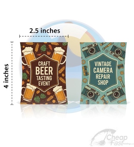
Browse 6 Full-Color Flyer Format Picks
These are 6 allocated products that map to full-color use cases. Use them to assemble a complete campaign set across different placement types.