Not all flyer formats are competing for the same kind of reading. A single-page flyer is optimized for scanning. A tri-fold flyer is optimized for an unfold-and-follow reader path.
If you choose the wrong format, you force your audience to do extra work. That work reduces conversion. The goal of this guide is to help you pick the format that matches your content depth and placement environment.
Pick single-page when you need clarity in seconds. Pick tri-fold when you need multiple structured sections and your audience can pause and open the flyer.
- Core Difference: Scan vs Unfold
- When Tri-Fold Wins
- When Single Page Wins
- Design Rules for Folds and Gutters
- Interactive: Tri-Fold vs Single Page Comparison Slider
- Interactive: Choose the Best Format for Your Use Case
- Cost and Production Considerations
- Browse 6 Format Example Picks
- Top 10 Tri-Fold vs Single Page FAQs
Core Difference: Scan vs Unfold
A single-page flyer delivers your message in one continuous canvas. That supports fast scanning: the reader can absorb headline, date/time, and CTA without needing to unfold.
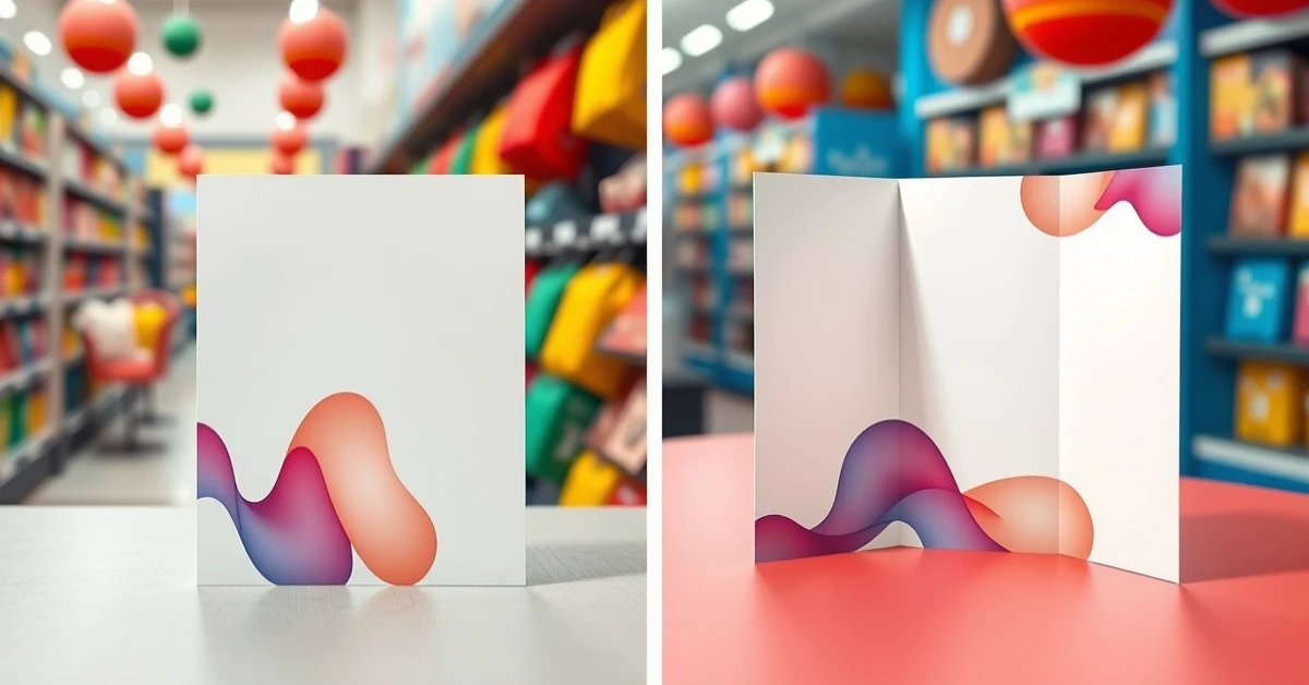
A tri-fold flyer delivers your message in panels. That supports a “reader path”: the front cover invites attention, and inside panels provide structured details. The trade-off is physical effort: the reader must open the flyer and follow the layout across folds.
So what should you decide first?
- If your content can be summarized in one quick CTA + essentials, choose single-page.
- If your content needs multiple sections (agenda, steps, comparisons, FAQ blocks), tri-fold can carry it.
- If your placement is a pause-friendly location (counter, desk, waiting room), tri-fold is more likely to be opened.

When Tri-Fold Wins
Tri-fold is strongest when you want to communicate more than just the basics. It creates built-in “chapters” where each panel can hold one decision-supporting idea.
Tri-fold performs well for
- Workshops and multi-step programs where people need a schedule and expectations.
- Service menus that include multiple offerings and price anchors.
- Real estate and professional services that need structured facts and proof points.
- Community information packs that residents will open at home or while waiting.
Tri-fold front panel should never be empty
The front panel acts like an ad. It should show what the flyer is for, the value promise, and a single CTA (often a QR). If the front cover does not earn the unfold, the inside pages will never be read.
When Single Page Wins
Single-page flyers are optimized for moments where readers have low patience. Think of street distribution, door handouts, quick office stacks, and short wait times.
Single-page is best for
- Events with a clear date/time hook and a simple action step.
- Short promos that can be explained in a few bullets.
- Door drops where people can scan and decide later.
- Situations where you want one clear QR CTA near the most important text.
Design it like a landing page hero section
Your single-page flyer should feel like your best “above the fold” content: headline, key info, and a single path to action. Everything else should support that path, not compete with it.
Design Rules for Folds and Gutters
Tri-fold design is not just a layout change. It is a production reality. Folds create gutters that can reduce the readability of content placed too close to fold lines.
Keep important text in panel centers
- Place body text mid-panel instead of near fold lines.
- Avoid placing QR codes directly over fold areas.
- Use panel margins so trimming does not push content into gutters.
Plan for how the flyer opens
Before you print, imagine how a reader opens the flyer. The inside panels should appear in a logical order that matches the decision journey: invite -> explain -> next step.
Use safe zone thinking (not just bleed)
Tri-fold requires both bleed safety and fold safety. For critical content (CTA, date, phone), use safe spacing so trimming and folding variation does not cut off your essential information.
Always review a tri-fold proof that shows panel alignment. If panels shift by a few millimeters, your layout can still look fine but your CTA might land in the wrong panel for the reader.
Interactive: Tri-Fold vs Single Page Comparison Slider
Use this slider to estimate which format fits your “content depth” and “pause time” assumptions.

Interactive: Choose the Best Format for Your Use Case
This widget turns your use-case into a practical format recommendation and provides a copy-ready section strategy.
Cost and Production Considerations
Tri-fold and single-page cost differences are usually driven by stock behavior and production handling. Tri-fold jobs must perform through folding without losing readability at panel edges.
What can increase tri-fold costs
- Sturdier stock that resists creasing and curling.
- More complex artwork planning across multiple panels.
- Extra proof time to validate panel alignment.
Where single-page often saves cost
- Simpler layout requirements and fewer folding alignment checks.
- Less risk from gutter overlap hiding essential content.
- More efficient distribution when readers do not need to unfold.
The best approach is to match format to reader behavior. A cheaper format that converts less can cost more in the real world because it fails to drive actions.
Tri-fold panel micro-layout rules (copy-ready)
When you design tri-folds, treat each panel like a separate decision moment. Do not place “big text walls” on multiple panels; instead, keep the reader moving through a simple sequence.
- Front cover: use a clear headline, one short value sentence, and one CTA (QR or a single URL/phone). The cover must earn the unfold.
- Panel 1: answer “what is it” with 3-6 bullets. Keep each bullet to one line so it does not wrap unpredictably after printing.
- Panel 2: show proof or logistics (schedule block, location, or “what to bring”). If you use a QR here, keep it away from the fold.
- Final panel / back: add next steps (how to register, what happens after scanning) and contact details. Make this the most readable panel.
Single-page micro-layout rules (high-scan design)
Single-page flyers should feel like they were designed for arm’s length. Your layout should be minimal and decisive.
- Top third: headline and hero image (or simple icon) to define what the flyer is for.
- Middle block: date/day and time window plus location. This block answers the “when/where” uncertainty.
- CTA zone: one QR or one call-to-action line with bold text. Put the QR/CTA on a clean background area.
- Support bullets: 2-4 bullets max. If you need more, tri-fold is usually the better format.
Distribution and storage behavior
Formats behave differently after distribution. A tri-fold is more likely to be opened at desks, waiting rooms, or counters. A single-page is more likely to be skimmed quickly and kept in a pocket, wallet, or folder.
Plan for those behaviors:
- If your placement is “fast scan,” your CTA must be obvious without unfolding.
- If your placement is “pause-friendly,” your tri-fold should provide a clear inside structure with a logical next step.
- If you expect people to store the flyer for later, prioritize durability and ensure your critical contact information is placed in a visible and non-edge area.
Fold proof pass (final QA)
Before you approve production, do a fold proof pass focused on reader flow. Confirm that the front cover CTA is visible and not pushed into a gutter area after trimming. Then check that the inside panels are readable when folded (not just when unfolded). If your QR appears on an inside panel, verify that it remains scannable even when the reader opens the fold and the flyer lies flat.
Common tri-fold mistakes
- Placing key text too close to fold lines.
- Using too many fonts or sizes so the reader cannot find the sequence.
- Trying to fit a dense paragraph block instead of using bullets.
- Designing without a proof that validates panel alignment after folding.
For tracking, it is often useful to place the primary QR on the front cover and optionally add a secondary QR inside. Keep both QR CTAs short and consistent so the reader never wonders what happens after scanning. Then compare results by placement: front-cover QR reads usually indicate stronger immediate intent than inside-panel scans.
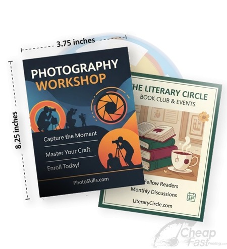
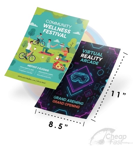
Browse 6 Format Example Picks
These six allocated cards are examples for this post. Use them as complementary pieces when you want multi-size campaign consistency.